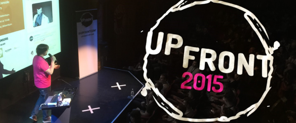
UpFront conference
Our Day . . .

The Space48ers arrived nice and early for a fun day!
After grabbing some brekkie we wandered in and I was delighted to see t-shirts, stickers and even notepads up for grabs, we all love a freebie! I was extremely chuffed to get my hands on the square papered notepad (they also had spotted graph and lined – good work team!). I’m a fan of the squared Moleskin myself so it made my day to have a nice, brown recycled card covered notepad, brand new and fresh for a day of note taking at the Up Front conference. Okay, that’s enough about the pad for now.
I thought I would share some of my highlights of the day, of course, all of the speakers were fantastic, but not everything is my forté. I wanted to share with you my personal favourites.
The day began with Simon Owen and Dan Donald offering opening remarks, as you do. Then on to the stage came Brad Frost. Personally, I quite liked his profile pic (wearing an Astronaut’s helmet), and as visuals speak volumes to me, therefore I deduced that it was going to be an interesting talk ahead.
Atomic design
Four pages of notes later, yes, I did find it rather captivating. He discussed his approach to design, his design methodology system ‚ÄòAtomic Design’. Brad starts off ‚Äòatomically’ then by creating ‚Äòmolecules’ and how he constructs simple ‚Äòorganisms’ from those molecules, then moving on to population of the templates for visual referencing, final testing, and sign-off, finally culminating in the largest ‚Äòorganisms’ AKA a fully functioning web page. I liked his project in collaboration with Dave Olsen, Pattern Lab, which assists you in (in my words) the creation of a live, smart, programmable, scalable, style guide. Have a wander about the site but PLEASE CLICK ON ‚ÄòDISCO’ (top-right of the menu) to view his entertaining responsivity testing function.

Afterwards, in the mid-morning break we soaked up some caffeine and shared the Space 48 love in the shape of cookies, chocolate brownies and gingerbread people.
Disconnected ensemble, scattered clouds
Then Soledad Penad√©s stole the stage. Supersole is a senior engineer at Mozilla and had a great stage presence, so bubbly, most probably why she’s been named an evangelist. Soledad reminded me of my digital technological experimenting friends over at the BBC R&D and the ‚Äòout of this world’ projects that they come up with. The freedom to be creative can be seen as arty, entertaining and lovely but also sometimes have the added bonus of a world-changing by-product.
By enabling one phone to act as a server and connecting multiple devices to via NFC connections with your friends – “Well, what else do you use NFC for? Touching your phone with a stranger’s is just weird” – you can access her musical web applications to then create live music with your friends. A drum machine and a (nod to a) theremin are included! Now, the by-product here seems to be the acting ‚Äòserver’ phone. As she mentioned in her talk, some countries are not as privileged as the UK and will have high data transfer costs and little connection. In this case, why not let one mobile device in the household download an update, for example, then act as the server, transferring that update over to any other nearby devices!? I suppose acting as a disconnected mini-cloud, a peer-to-peer web. On another point, Soledad’s blog is brilliant, personal and exciting.
Internet of browsers
Ben Foxall invited us all to embrace the idea of pushing the boundaries of how we interact with technology. Himself a developer who is particularly interested in data, the Web, and visualisations. Using a native web application, he was able to tell us the percentage of battery and some other basic facts (I imagine much more information could be scraped, but we trusted him). Then Ben acted as a conductor, asking us to push particular buttons at precise moments could, obviously, aggregate our data and attempt at establishing (not quite pinpointing, with human error and all) a location for us. Thus being able to then access each individual phone as if it were a player in an orchestra, individually, and play sounds on it that would then wave across the auditorium, including a parliament (flock) of rooks and a concentration of Kingfishers.
That was fun!
It reminded me a little of a project that I collaborated on with a developer about ten years ago at college and with the Whitworth Art Gallery, which included recycled computers, a sound sampling application and a series of strategically placed speakers. Cue live, lightly rehearsed, mainly improvised, electronically sampled soundscapes which immersed the audience in a wash of sounds and emotions. We could definitely use Ben’s application for something multi-layered like that!!!
Web typography
I was definitely in my element when listening to Richard Rutter’s talk on web typography. So much makes absolute sense in regards to mood and readability. He began by quoting ‚Äògood typography induces a good mood’ taken from the Aesthetics Of Reading. We read in saccades, jumping across words rather than reading every letter (I found a Microsoft paper on it here), therefore, there are recommended minimums and maximums line lengths, of where our eyes and brain can stretch to in regards to reading patterns. This includes having the optimum whitespace in between, created with line-height, margins and padding. He also discussed picking fonts for their families and pairing. Not using a pleasing type setting or font will induce anger, well, in me for one!

Type scales were covered including iOS, diatonic and the golden ratio scale, obviously to assist with the clarification of hierarchy, but don’t forget to alter these according to the device. Also you can estimate the size of text on screen (or also on print) or even on the moon as Richard demonstrated, with this nifty little online tool. Richard seemed to hold a wealth of type secrets in his reserve, which I was pleased to be privy to. Mentioning the additional font variations available within OpenType, that I’m sure we’re all aware of but I didn’t know about the advanced font-feature-settings in CSS (see his sandbox here), which apparently W3C advise only to use in special cases. His website ‚Äòtypography’ sub-section can be found here, and contains some really interesting reads. His slides are online here.
Design decisions

To close Yesenia Perez-Cruz, a Philadelphia-based designer, discussed performance when designing for the Web. She mentioned, amusingly to the audience, that she ‚Äòused to be a reckless designer’. Now the focus of her talk was on performance, load-speed and weight of the design but, what I really liked about the talk was her focus on communication and workflow. How from right at the beginning at the business development stage, the team understand the importance of performance and from experience, what is good practice and what is possible. This limits any miscommunication from sales to design, meaning that the developers aren’t suddenly thrown a heavy and complicated design right at the end. Design and build can be done in a more parallel way rather than a waterfall effect. Including the whole team (okay, maybe just one from each area) from the start means that nobody is left in the lurch and time scales are less likely to run over and optimisation not left until the very last minute.
It’s all about collaboration and communication!
In closing
Many thanks to my favourite speakers featured here, I have half a squared notepad full of interesting snippets and research. My brain is buzzing and my creativity is flowing. Cheers to Manchester Digital (Katie and Rachel), Jack Sheppard, Simon Owen and Dan Donald for organising a brilliant day. We are pleased to sponsor and support such an event and looking forward to an Up Front Conf. 2016?
Header image courtesy of Creative Bloq – thanks guys!


