5 examples of effective ecommerce checkout processes
Nowadays in ecommerce, consumer expectations require brands to give customers a smooth route to purchase and good user experience on their websites. Streamlining the checkout process is key for achieving more conversions – reducing the friction and number of clicks – but brands also must give customers the right information about their orders, whilst using persuasion tactics to maximise AOV (average order value), like personalisation.
There’s a delicate balance to be found, which is a challenge for ecommerce businesses and UX designers to tackle. Space 48’s Creative Director, Anna Green , has picked 5 great examples of effective ecommerce checkout processes demonstrated by major retailers:
ASOS
ASOS has long been a trailblazer for ecommerce brands in the fashion industry, leading the way on customer service, categorisation, search and product pages. In our recent blog, 10 Awesome Tips for Creating Effective Ecommerce Product Pages, we used the ASOS website as inspiration for those looking to create great product pages.
From their product pages, once you’ve chosen your size/colour, etc, and clicked “Add to bag”, a pop-up gives you the option to checkout or go to bag, with a summary of basket contents (including images).
Clicking through to the checkout gives you the option to sign in/register or checkout as a guest. The checkout page is a streamlined webpage, comprising of a simple bag summary, with product details on the right-hand side, whilst the left-hand side has stacks of modules/actions to follow, starting with the option to add a promo code, followed by an email recognition field.


Next is clear delivery address or click & collect option (the latter with a search feature to locate your nearest pick-up spot). The results display a very helpful set of options, with maps and an easy-switch choice between low cost delivery and fast delivery, with delivery date expectations and price.

New customers are prompted to give their name and a mobile number (for delivery updates).
Finally, you’re required to add your billing address, which once entered (either manually or with an address finder tool) becomes another stacked summary, before getting the option to pay by card or PayPal, and place your order.
It’s a slick, user-friendly checkout page, which doesn’t have lots of bells and whistles or colour (it’s mostly black and white), but has the right functionality for entering data without feeling like a slog. The options are simple and helpful, with a subtle upsell in the form of an additional stack to the checkout summary, offering ASOS Premium Delivery UK – which gives customers next-day delivery for a year for just £9.95.

Lush
Another Space 48 favourite, Lush is expressive with its colour palette on product pages – and for good reason! Their products are colourful and eye-catching, reflected brilliantly with their product pages.
Take their Halloween bath bombs for example. The product page is vibrant, with an auto-play video header displaying the product effervescing in bath water, with a neat product summary box, with an “add to wishlist” button and a more prominent “add to basket” button. Scrolling down gives you more product details, ingredients, customer reviews and tutorials.

Adding to basket takes you to a confirmation page, which contains a related product, plus a prominent CTA button to go to checkout and links to view basket, homepage or previous page.

Checkout begins with an email address prompt, with a two-choice option to enter a password or to continue as guest (the latter set to default). Everything now is devoid of distractions and drained of colour, much like ASOS’s approach. Billing address set to the same address as delivery address, meaning faster checkout.

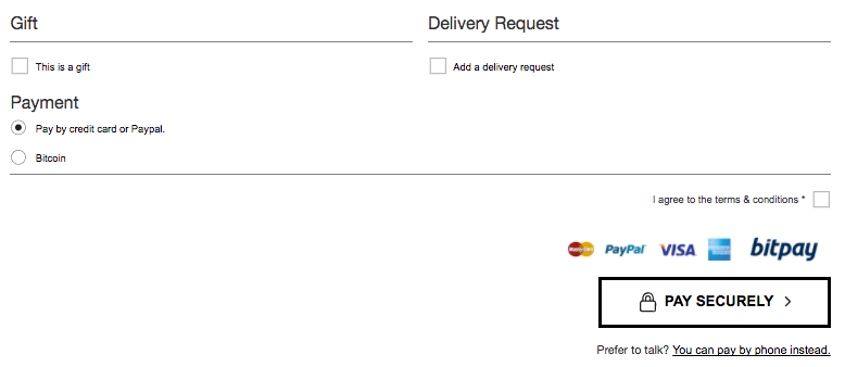
The order summary before payment details is clear and extensive, with the options to switch from the default standard delivery to next working day delivery. You can add additional delivery requirements in a free text field, click a box to confirm as a gift and choose to pay by card, PayPal or even bitcoin!

Cass Art
On the Cass Art website, adding to basket takes customers to a busier product summary, but with some nice touches, such as a clear message about free delivery thresholds, “spend another £25.00 to get free delivery.” There’s also a countdown clock, telling users how long they have left to get guaranteed delivery before the weekend with next working day delivery.

The checkout process has guest checkout set to default, with just the request for an email address submission. The next page has two large delivery option boxes, including drop-downs for each. Choosing to click and collect leads to a store locator function and the results show nearest store, free delivery and delivery date. Selection triggers a short form to enter name and phone number, plus a CTA button leading to a secure payment page.

With home delivery, an address finder then leads to another neat drop-down to enter either card details or PayPal, along with a reiteration of the free payment threshold and the product summary.
Pact Coffee
We chose Pact Coffee due to the user-friendly and simplistic approach to its checkout process. The add to basket CTA button takes you straight to the checkout. It does prompt you to login in or create an account to go further, but the brand wants to build a tailored relationship with its customers.

The summary informs users that delivery is free and first class. The “create account” option is a very simple checkout & payment page, which adds a touch of humour with example customer details fields and a no-frills payment card details field to complete purchase.

Whisky Exchange
The checkout process for Whisky Exchange is slightly longer, but due to the nature the products, it’s just as effective. The checkout process displays good customer experience and strong customer service, reassuring consumers and building trust.
“Secure checkout” is displayed proudly, whilst standard delivery, pick-a-day delivery and click & collect are all offered.

Customers are made aware of an additional surcharge for specific postcodes, there’s a clear and friendly offer of help from their customer service team and an option to checkout with Amazon Pay, as opposed to payment card, PayPal or phone.

The “choose a day” delivery method has a simple module for selecting a date and picking a specific delivery time, accompanied by the cost for each option.

The extra step in the checkout journey is a range of relevant offers, for upselling to the customers – helping to increase AOV.

Crucially, adding one of these additional items to your basket doesn’t impact the route to purchase. The current page updates with a short message updating users about the new cost (excluding charges), including an option to modify the basket.

The next step presents a guest checkout form and an existing customer form, with some highlighted notes/warnings for ensuring your delivery can is efficiently fulfilled, including data fields to input delivery instructions and information for the Whisky Exchange customer service team. Again, due to the type of products, often bought as gifts, there’s an option to create an personalised gift card for just 50p – with 10p from every gift card going to charity, a final cherry on top for this hugely customer-focused checkout process.

Summary
As you’ve seen from our examples, there’s no one-size-fits-all solution for optimising the checkout process for your ecommerce website, as different methods and features are suitable for different brands – according to factors such as industry, product type and business size. However, you’ll see certain trends and UX tactics being replicated, such as streamlining the numbers of clicks, giving clear – but not too many options – to customers, removing distractions from the route to purchase and making delivery options flexible and appealing.
{{cta(’22a10b11-1920-4129-a2cf-6947d5ea7958′)}}
Space 48 is a leading UK ecommerce consultancy and website development agency, specialising in Magento ecommerce websites. If you need advice, an ecommerce assessment or audit, or perhaps you just want to discuss a project, contact our team and see how we can help.


