Creating a conversion focused product page
9 ways to optimise your regular product page
When somebody asks for my thoughts on the design of a product page, I don’t focus on the colours used, the images used or if it has a minimalistic design. My immediate thought is, will it convert?
Taking the price of a product out of the equation, the conversion of a product page often depends on the right information being displayed and whether or not it enforces the customer’s need for that product.
Why is it so important?
For some retailers and brands, Google Shopping can account as their main source of online revenue and the customers using this platform are taken directly to the product page. Now I don’t need to tell you getting a user from Google Shopping to your product page isn’t free. Therefore, you need to make the most of your product pages to increase the chance of users converting or at least finding alternative products.
Clear imagery
As a user cannot use any senses other than their sight when shopping online, they require compelling imagery that will trigger their imagination for how a product may feel when touched or how it will look when used. Your product images therefore need to be of high quality; well lit, on a white background, offering a 360° view of the product. Lifestyle shots and close-ups of the finer product details are also important to demonstrate the size, texture, features and functionality of the product.
A great example of a company using product imagery well is ugmonk.co. Using a series of images, they have clearly depicted the quality and value of the product, without the need for the user to read the description.

One of many overall product images. Bright and high quality.

In-use lifestyle shot showing some functionality.

Close up image showing the features. Offers a further sense
of what the material is like, including its water resistant properties.

Lifestyle shot. To help the user determine the size and how it will look when being worn.
Detailed Descriptions
Your description of a product is as important as your product imagery, the two go hand-in-hand. The description of a product needs to also fulfil the senses which a computer screen cannot transmit. For example if you’re selling a brown leather belt, don’t simply say what it is but describe what it is made of, it’s size, what it feels like and any other selling points – use plenty of adjectives and nouns! Is it simply just a brown leather belt? Or is it a much more desirable ‘soft touch Italian leather belt with a lightweight aluminium buckle?’
Tip: As a user’s attention is precious and often limited, you may want to bullet point the product’s key benefits and features for easier reading.
Video Content
Well produced short product videos make for great content and will complement product descriptions and imagery. Videos can demonstrate a product in use and will often increase customer demand.
A great example of a brand using video well is Lake District based Millican, displaying how well designed and practical their rucksacks are.

Millican video displaying how much can fit into their product ‘Dave The Rucksack’.
Straightforward Delivery Information
If a user wants to find out when they are likely to receive a product, the chances are they are keen on making a purchase. Providing information explaining delivery lead time and cost is important. If the product meets a free delivery threshold you have in place or if they order the product before 1pm to receive it next day, make this clear, this may determine whether or not the user converts.
Bathroom retailer, Better Bathrooms cover all the details needed regarding delivery within a small section:

Along with this larger section displaying further information about delivery services. If this information still does not satisfy, there is also a link to a dedicated delivery information page:

Stock Availability
If a user is looking for an item that is or isn’t in stock, make it known. If it isn’t in stock, provide the user with a date when it will be back in-stock so they can determine whether to wait and return or look elsewhere. A significant amount of site traffic will be made up of those users who are researching and browsing with no intention of actually buying, or at least yet. However, we are aware that you can often persuade a user to purchase an item earlier than they intended and you can do so by displaying a message which indicates there is only a small quantity of the product left available.
For example, when there are less than 10 products left in stock on Amazon an alert is shown to the user. Displaying a low stock level indicates the product is popular and creates an innate fear of scarcity, even more so if there is an offer being displayed!

Amazon displaying when a product has reached low stock levels
Tip: Another way to trigger a sense of urgency is to present a countdown timer on your site or product page indicating an offer which will expire if they don’t order soon. Fast fashion retailer Missguided use this tactic across their product pages.

Missguided use a countdown timer to hurry the users buying decision
Customer Reviews
Organic content from genuine reviews plays a strong role in the conversion process as they offer independent product information which may have not previously been mentioned. During the buying process users do a lot of research and reviews are often at the forefront of this, with even the odd negative review working in your favour.
Tip: If you identify information from a users review as being useful, use this information in your own product description.
Up-Selling and Related Products
If you are not doing so already, up-selling and providing related products to your users is an effective way to increase your average order value. Department store Selfridges use up-selling effectively:


Selfridges set a good example of how to up-sell
So, as you can see above I’m viewing an £89.00 pair of shoes and on the off chance the shoes aren’t quite right for me, underneath Selfridges suggest two similar styles within the “You May Also Like”. These are up-sells and would cost me between £16 – £31 more than my original choice, respectively spending an additional 18% or 35% more.
Like up-sells, related products are an opportunity to display other products in your catalogue. However these products are ones which complement the product the user is currently viewing and not an alternative. Equestrian retailer Naylors showcase their related products well:


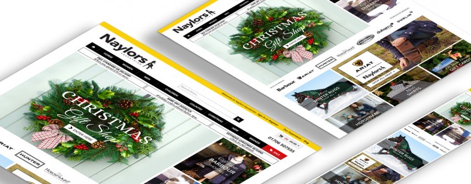
Naylors advertising products which can accompany the main product to ‘get the look’.
Unique Selling Points and Discounts
If you are running any promotional offers and discounts or you offer any USP’s such as Free Returns and free warranty, ensure you include this. It may sound obvious but the clearer the USP’s the more you can differentiate from the competition and encourage conversions.
Call To Actions
Don’t make users second guess what is required of them to place an order. Making even the most rudimental call-to-actions clear and self-explanatory will make for a better online experience. Multinational retailer Next present a straightforward options list for a configurable product with a clear ‘Add To Bag’ call-to-action.

Next’s clear call-to-action prompts the user to add the item to their shopping bag.
Summary: Our primary focus when optimising a website is how will the changes generate our customers a return. The detailed changes mentioned will collectively aid a better user experience and a more positive conversion rate. As with all on-site changes, ensure you have enough activity data from before and after in order to measure the effectiveness. To do this, we recommend A/B split testing whilst also being aware of any outside events which may have affected the chances of a fair test.


