Best examples of BigCommerce Stores

We’re part of Dark Matter Commerce - find out more

BigCommerce is one of the most popular ecommerce platforms on the market. In this guide, we will share some examples of stores that are built on BigCommerce, along with other ecommerce technologies that retailers have partnered with.
BigCommerce was founded in 2009 in Australia and is now headquartered in Austin, Texas. In the last few years, the company has adjusted its strategy away from purely targeting SMB businesses and now looks to better serve the enterprise and mid-market businesses. This has led to rapid growth in the number of retailers choosing BigCommerce.
This is in part, due to its “Open-SaaS strategy” which ecommerce retailers of all sizes find attractive. This approach blends the feature-rich and reliable ecommerce SaaS platform with a comprehensive set of APIs. It enables businesses to get all of the benefit of SaaS (uptime, performance, scalability, reduced maintenance & upgrades) with the flexibility of open-source. This has attracted many merchants that may have previously chosen Magento, Shopify or even Salesforce Commerce Cloud.
To give you a flavour of the breadth of what can be achieved with the platform, hereere are some examples of the best and most exciting brands that have chosen BigCommerce for their online shop. We have also broken down each site and provided the technology partners that the store has partnered with to give further background on what makes each one tick.
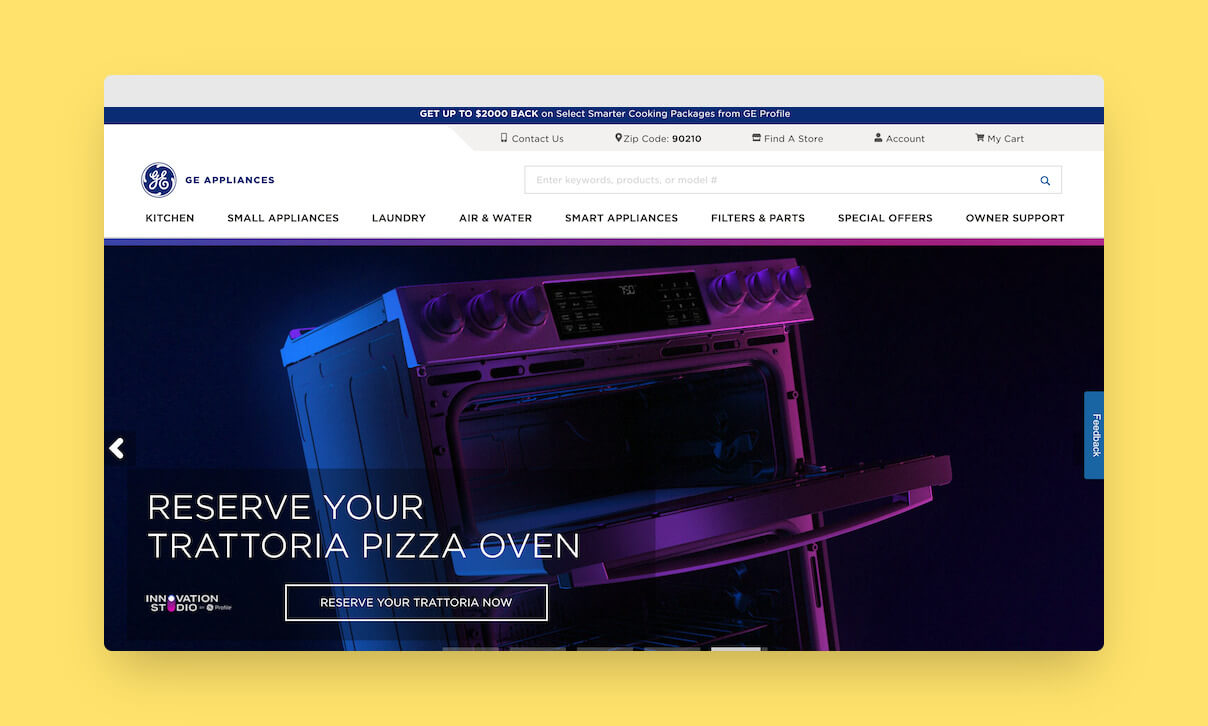
GE Appliances, a Haier company are a US household name and moved their online store to BigCommerce last year.
From spending a little time browsing the site, it’s clearly been a big project with a lot of time and thought gone into it. Great effort to all involved.
They’ve done a really good job at blending content and commerce with BigCommerce & Shogun. A portion of the catalogue is orderable direct, and for everything else, they make use of PriceSpider to show availability in retailers.
A common ecommerce UX recommendation is to include content results alongside product results. With Searchspring, GE Appliances has gone a step further and even search the knowledge-base and all of the product manuals which is impressive.
It’s clear that a lot of work has gone into this site bringing a veritable feast of best of breed partners together.
• Cybersource payments
• Affirm for buy now pay later
• Certona (now Kibo) and Salesforce interaction studio for personalisation & segmentation
• Bazaarvoice for reviews
• Salsify looks to be in place as a PIM.
• Ecorebates for rebate savings offers
• Salesforce CRM
• Salesforce live agent chat
• Medallia (Kampyle & Cooladata) for customer feedback & analytics
• OneTrust for cookie compliance
• Hotjar for real user monitoring.
• Upland Adestra for email marketing
• Google, Microsoft, Facebook and Pinterest for ads & remarketing
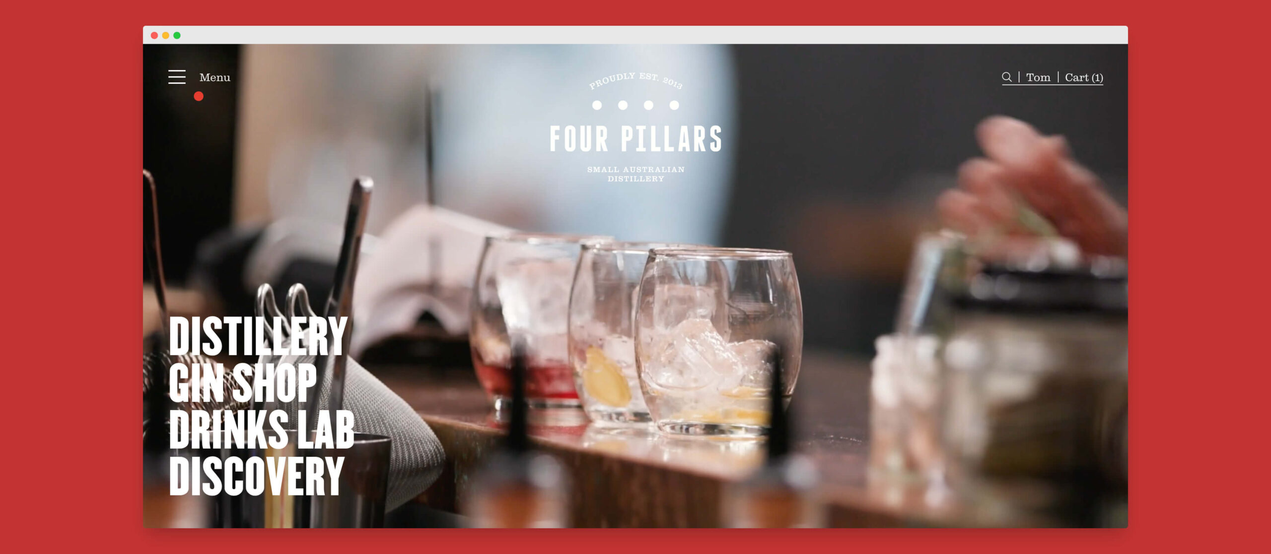
“We are not a retailer. We are a brand that sells”, Matt Jones – Co-Founder of Four Pillars Gin, an Australian Distillery.
As their brand has grown and matured, Four Pillars didn’t want their ecommerce website to get lost in the sea of cookie-cutter sites. They didn’t want to exchange the immersive brand experience for a few short-term conversion rate optimisations. That’s an admiral position to take and one that results in them standing out from the crowd.
They have a really strong brand that I feel is communicated really well with their use of high-quality video and imagery. Add to that the smooth web experience with careful use of transitions, and it really brings it to life.
To achieve this, they partnered with Overdose. and ultimately opted to pair WordPress for content management and BigCommerce for ecommerce capabilities. These technologies are spun together with a Vue.js headless frontend implementation and redirects to BigCommerce for the checkout process.
From the case study and from looking at their site, we can see they’ve partnered with the following:
• Foursixty for shoppable instagram feed
• Klaviyo email marketing.
• Eway payments
• Microsoft Clarity & Hotjar for heatmaps and session recording.
• Google Optimize for A/B testing.
• Facebook, Pinterest and Google advertising.
• Starshipit for carrier integration.
• Ezywine ERP
Read the Official case study and Overdose’s own one.
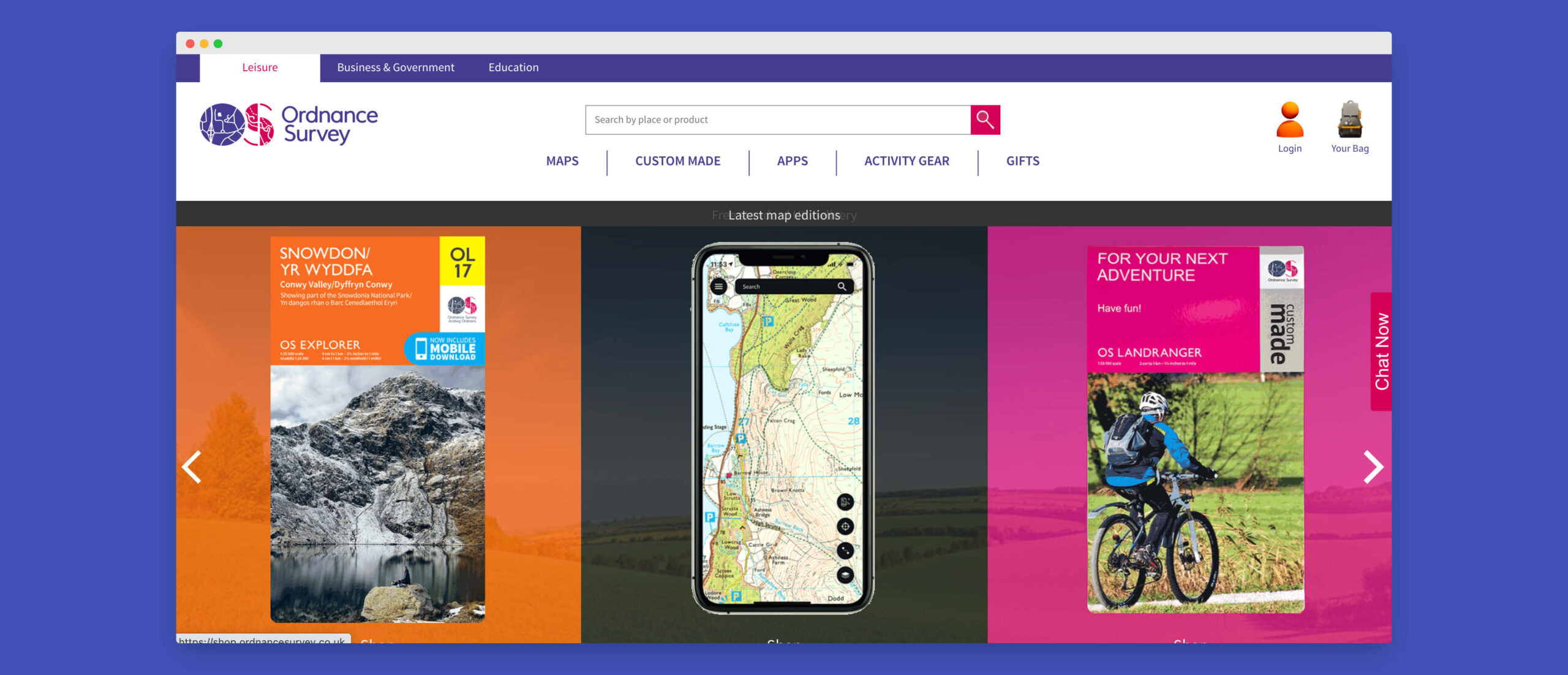
Ordnance Survey is the national mapping authority for the UK and their leisure team have made it their mission to get more people outside.
The shop team chose to migrate from Magento to BigCommerce as the open-SaaS ecommerce approach is a better fit for the business needs.
And ok, I’ll admit, this is a little self-promotion as it’s a Space 48 project, but it’s one that will always hold a special place in my heart. I just love working with their incredible team including Tom Brown and Anna Burkitt.
There’s a lot going on behind the scenes with this one, but the third party tech chosen included:
• Contentful for expanded content management capabilities
• Worldpay & PayPal payments
• Single-sign on with Microsoft ActiveDirectory
• ShipperHQ for advanced shipping method logic including delivery estimates.
• dotdigital marketing solutions
• LivePerson chat
• Loqate, a GBG solution address lookup
• Qualtrics surveys.
• Civic UK cookie control.
• Microsoft, Facebook and Awin Global advertising.
This was also our first project to use BigCommerce’s Checkout JS SDK to create a custom checkout & payment experience, resulting in a 130% increase in conversion rate.
Find out more in the official case study.
“𝙒𝙝𝙚𝙣 𝙄 𝙡𝙚𝙖𝙧𝙣𝙚𝙙 𝙩𝙝𝙖𝙩 𝙩𝙝𝙚 𝙘𝙤𝙪𝙧𝙞𝙚𝙧 𝙬𝙤𝙪𝙡𝙙𝙣’𝙩 𝙗𝙚 𝙖𝙗𝙡𝙚 𝙩𝙤 𝙙𝙚𝙡𝙞𝙫𝙚𝙧 𝙞𝙩 𝙤𝙣 𝙩𝙞𝙢𝙚, 𝙄 𝙟𝙪𝙢𝙥𝙚𝙙 𝙞𝙣 𝙢𝙮 𝙘𝙖𝙧 𝙖𝙣𝙙 𝙙𝙧𝙤𝙫𝙚 𝙩𝙝𝙚 𝙩𝙬𝙤 𝙝𝙤𝙪𝙧𝙨 𝙩𝙤 𝙙𝙧𝙤𝙥 𝙞𝙩 𝙤𝙛𝙛 𝙩𝙤 𝙝𝙚𝙧”
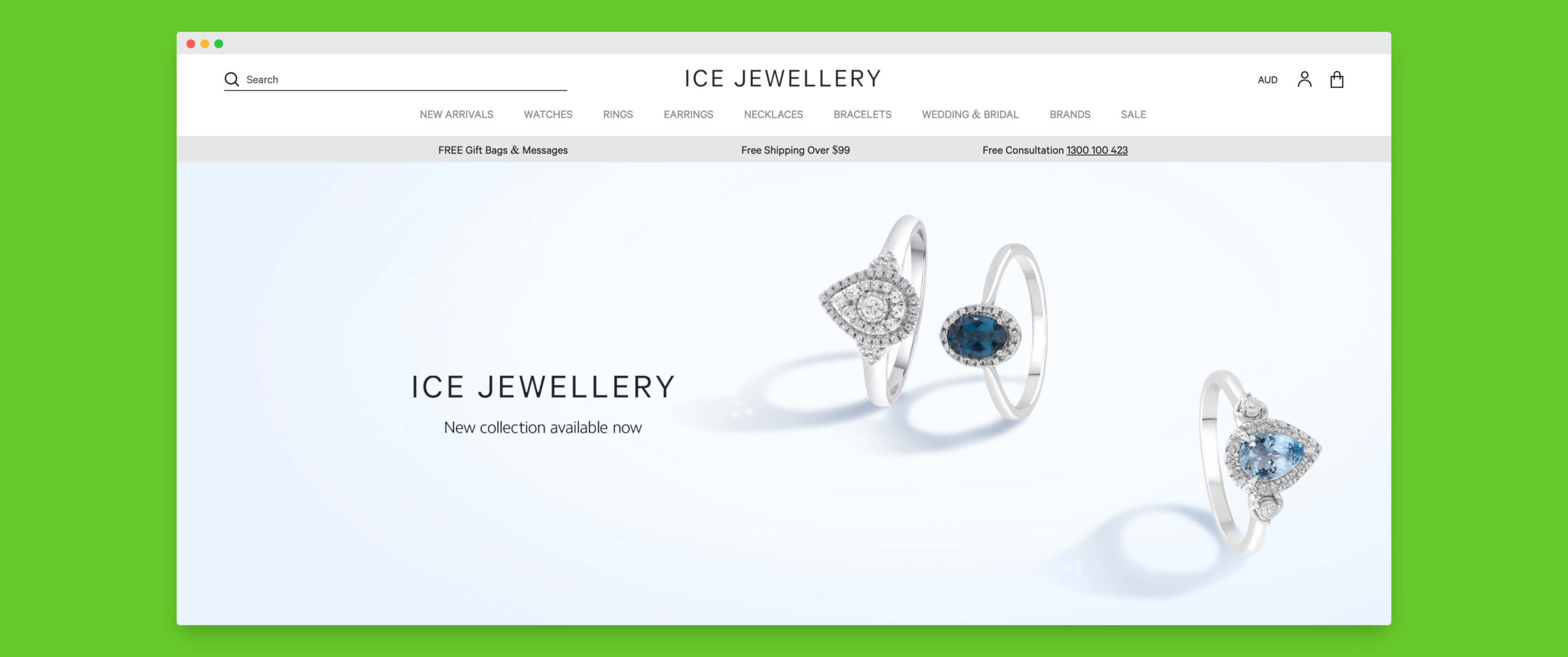
I love this from Simon Molnar, founder and CEO of Ice Jewellery. They are an Australian success story that shares similar origins to BigCommerce itself.
Ice Jewellery launched on BigCommerce in April 2020 and even with reducing their marketing spend by 60% during those uncertain times were turning over 10% more revenue with their upgraded ecommerce site.
Here’s my breakdown of their tech partner power-ups:
• Barilliance for personalisation
• Afterpay, PayPal, Eway Rapid
• Fast Simon Inc. for search (aka InstantSearch Plus)
• Reviews are handled by Trustpilot and Google reviews
• Automated Categories – our app for automating assigning products to categories 🙌
• InStock Notify – back in stock notifications
• Mailchimp
• preezie – guided commerce
• Story Widget – create and Instagram style stories to your store
• Hotjar for user monitoring
• Olark for chat-based customer service
• Advertising through Google and Facebook
• Supported by Albert: Artificial Intelligence Marketing, an auto-optimising advertising tool
Beyond that, a few neat features of the site implementation by Moustache Republic to call out:
• Product videos shown on hover for selected products on PLPs
• Infinite scroll/Lazy loaded pages on PLPs
* The ability to add a free gift bag and message to your order
Check out the official case study for more information.

La Perla, the luxury Italian Lingerie, Sleepwear & Swimwear brand re-launched on BigCommerce last year culminating in winning a BigCommerce Award with their partner, Like Digital & Partners.
Similar to previous sites I’ve reviewed, this is another global brand with a creative, high-quality #design paired with a well-polished implementation.
As always in ecommerce, it takes a village and La Perla has partnered with some of the best to create an exceptional customer experience.
We have:
• Global-e to supercharge the international expansion providing localised ecommerce experience.
• Creative content pages with Shogun.
• PLP navigation and filtering experience powered by Attraqt.
• The Fit reduces returns with their specialist approach to size & fit guides.
• Quantum Metric – a new one for me – analytics tool optimised for continuous product design.
• Klarna for payment plans
• Advertising powered by Flashtalking, Google Remarketing, Pinterest, Facebook & Rakuten.
In the back office, we learn from a job posting that other partners that likely are involved are: Emarsys, Akeneo, Canto and Microsoft Dynamics 365.
A couple of some really nice UX touches on the site to call out:
• On category pages, there is the option to browse by model or product image
• On the product page, they have ditched the traditional slideshow and show all product images on scroll which is effective.
• There has definitely been care and attention paid to accessibility with the advertised goal of achieving a minimum of AA compliance which is great to see.
lyres.co.uk
Lyre’s Spirit Co award-winning non-alcoholic classic spirits mean that “everyone can enjoy the mirth and merriment of a soiree or shindig”.
And if you’re like me and you’re persuaded by a good label design, then you’ll be picking Lyres every time. The line drawings of anthropomorphized animals are brilliant. I can see them having a lot of fun with animated versions.
When browsing the site and learning about the brand it’s immediately clear that they’ve had a lot of success – the brand started out in Australia but are now taking over the world. So as you’d expect their BigCommerce store is global-commerce-enabled and has been localised to an impressive 26 regions with appropriate translations and currencies.
My breakdown of what’s making this online store tick:
• Weglot translations
• Shogun for landing page designs
• Yotpo for Reviews and Loyalty.
• Qzzr powers the party planner quiz.
• dotdigital for email marketing
• Back in stock notifications with InStockNotify
• Smarter Click for exit intent overlays, e.g. shows remaining spend required for free delivery
• Klarna and Afterpay finance options
• Braintree/PayPal & Stripe payment options
• Loqate, a GBG solution for address lookup at checkout
• Rakuten for affiliate program
• Taboola and Microsoft advertising
• Smartlook for user behaviour monitoring.
From the case study, we also know that ShipperHQ, ShipStation, TaxJar | A Stripe company, SYSTEMA & Zapier are in play on the backend.
Massive shoutout to the team at Moustache Republic team on this one.
One final note on the implementation which I found interesting is that the recipes on the site are set up as BigCommerce products with a different theme template. This is a really neat way of doing it as it means Lyre get Yotpo reviews and product recommendations “for free”. 👏
Read the BigCommerce and Moustache Republic case studies and A fish named Fred is an eye-popping boutique men’s fashion brand. The vividness of the brand and product selection drew me in straight away. A Dutch brand, it only delivers to mainland Europe so my British colleagues and I will just have to wait. Perhaps I’ll ask Guido X Jansen 🧠 🛒 🎙️ to smuggle me some on his next trip.
Here’s my breakdown:
• Weglot provides translations between 5 languages
• Mailchimp for emails including abandoned basket recovery and uses a site popup to collect emails.
• A nice and simple Lookbook built with BigCommerce‘s pagebuilder.
• Size charts managed through Prikid Size Charts App for BigCommerce.
• WhatsApp chat used as a customer support channel.
• Integrated with ChannelEngine as the source of product & stock information.
• Payments powered by Adyen
• Shipping powered by Sendcloud – impressive offering, I’ve not come across them before.
• A separate B2B portal, I hope that gets moved over to BundleB2B in time 😉
Credit to A fish named Fred & their partner Thesio – Software & E-Commerce 👏
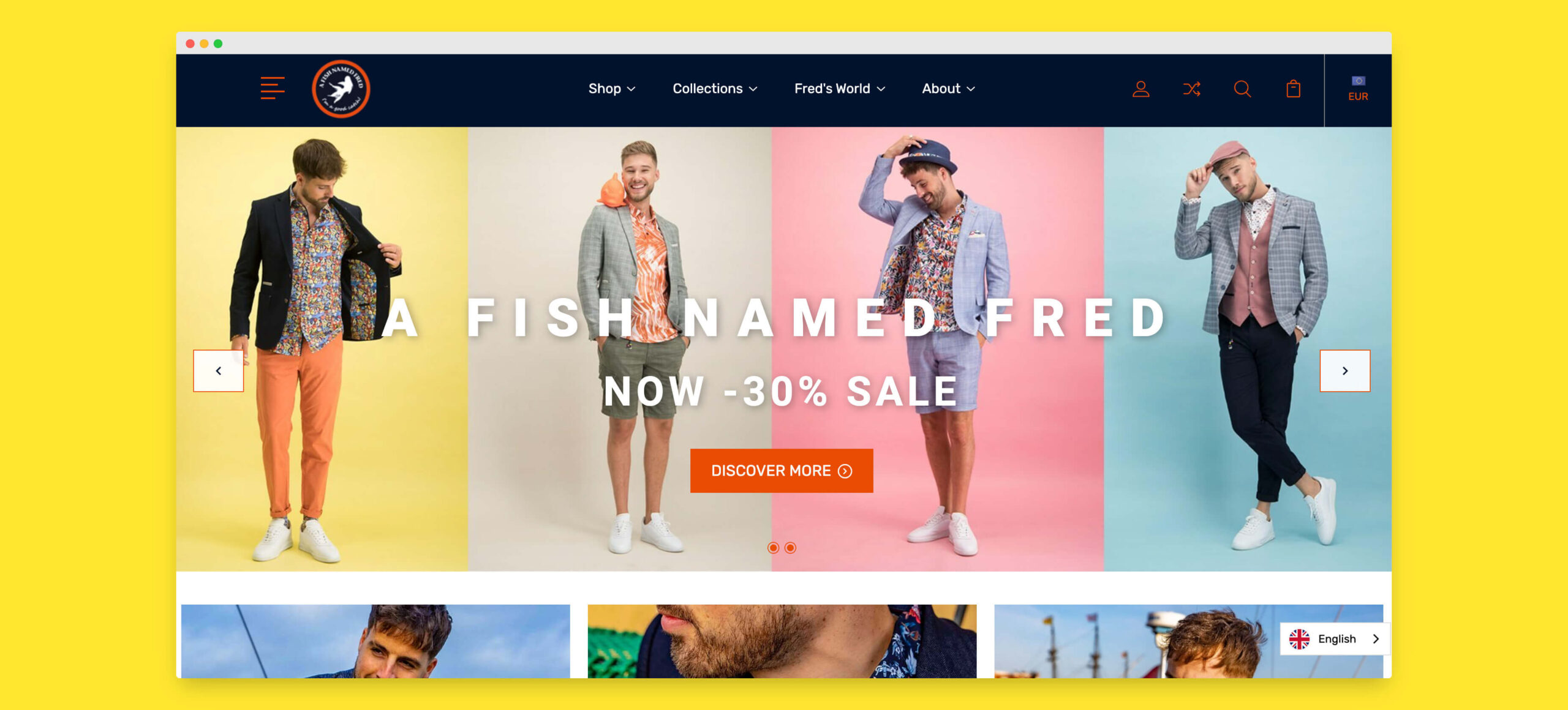
A fish named Fred is an eye-popping boutique men’s fashion brand. The vividness of the brand and product selection drew me in straight away. A Dutch brand, it only delivers to mainland Europe so my British colleagues and I will just have to wait. Perhaps I’ll ask Guido X Jansen 🧠 🛒 🎙️ to smuggle me some on his next trip.
Here’s my breakdown:
• Weglot provides translations between 5 languages
• Mailchimp for emails including abandoned basket recovery and uses a site popup to collect emails.
• A nice and simple Lookbook built with BigCommerce‘s pagebuilder.
• Size charts managed through Prikid Size Charts App for BigCommerce.
• WhatsApp chat used as a customer support channel.
• Integrated with ChannelEngine as the source of product & stock information.
• Payments powered by Adyen
• Shipping powered by Sendcloud – impressive offering, I’ve not come across them before.
• A separate B2B portal, I hope that gets moved over to BundleB2B in time 😉
Credit to A fish named Fred & their partner Thesio – Software & E-Commerce 👏
Here’s the official case study.
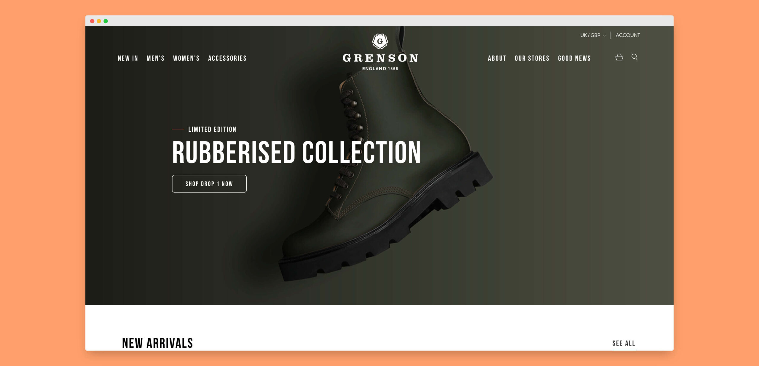
With Will Smith on the cover of GQ donning a pair of Grensons, I had to feature them as my BigCommerce Site of the Week this week. Let’s take a dive into what makes it tick.
My first impression of the brand is one of quality and longevity in who they are and what they do. It has a rich heritage that has had to adapt over the 150 years of commerce that it’s witnessed. A brand that is still young at heart, they offer a modern & attuned ecommerce experience.
A few notable features of their offering to call out are:
• A repair service. When you buy a pair of Grenson’s, it’s clear that they’re going to last.
• Custom Grensons. The Grenson Lab offers that sought after personal touch where you can design your own pair.
• Free global returns. Partnering with DHL, they offer free returns regardless of where you are in the world – quite the USP.
Coming back to the site itself. Let’s look at the chosen tech for their BigCommerce based site:
• Shogun & the BC PageBuilder for content landing pages
• dotdigital email marketing
• Stripe & PayPal payments
• Wisepops for promotional popups
• Klevu for search
• Fetchify (previously Crafty Clicks – ClickToAddress) address lookup
• Geo Targetly for ensuring that customers get the localised experience.
• InStockNotify for back in stock alerts
• Rakuten and Facebook for advertising
• DHL for returns
Congratulations to the team at Like Digital & Partners for the launch.
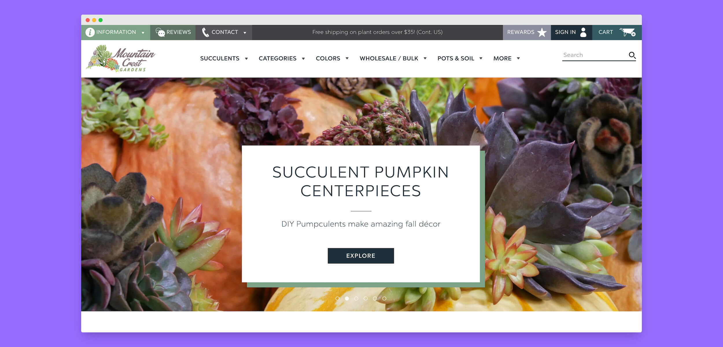
Mountain Crest Gardens are the ultimate succulent store with a long & successful history on BigCommerce. In their case study, they recognise over 400% growth while on the ecommerce platform.
The gardening vertical comes with a lot of particularly unique challenges online. To call out a few that have been tackled well by Mountain Crest Gardens and the Arctic Leaf team:
• There’s often a huge range of obscurely named products that have little meaning to the beginner. Visual guided category navigation both in the mega navigation and on home and category pages reduces this burden on new customers.
• Plant product photography is a lot harder to do well – it’s often naturally very busy and colourful which can be overwhelming compared to the traditional product cut-out shots. They’ve tackled this, firstly with a clean & simple site design that lets the product photography & video take the attention, but I think the user-generated content in the form of customer photos is particularly effective.
• Another challenge to call out is the sheer amount of information that needs to be communicated such as planting instructions & tips. A lot of effort has gone into the product detail pages with easy to read guidance as well links to more in-depth articles. That handles the known unknowns, but then the product Q&A section ensures customers get an answer to everything else.
I’m sure this is just a snippet of all the thought that the team has put into how they can offer a better customer experience. With all that effort comes a broad range of technology partners:
• Authorize.net, Amazon Pay, PayPal for payments with Sezzle for customer finance.
• PayWhirl Inc. for subscriptions
• Attentive SMS marketing
• Privy and Klaviyo for email marketing
• 4-tell (now Searchspring) for search and personalisation
• Rivet Works, Inc. for social engagement & reviews
• Lootly loyalty and rewards
• TrustSpot for photo reviews
• Answerbase.com Q&A
• Shopper Approved customer reviews
• Re:amaze by GoDaddy live chat/help desk & FAQs
• Hotjar, Moat for analytics
• Microsoft, Pinterest, Facebook advertising together with affiliatly.com for affiliates management.
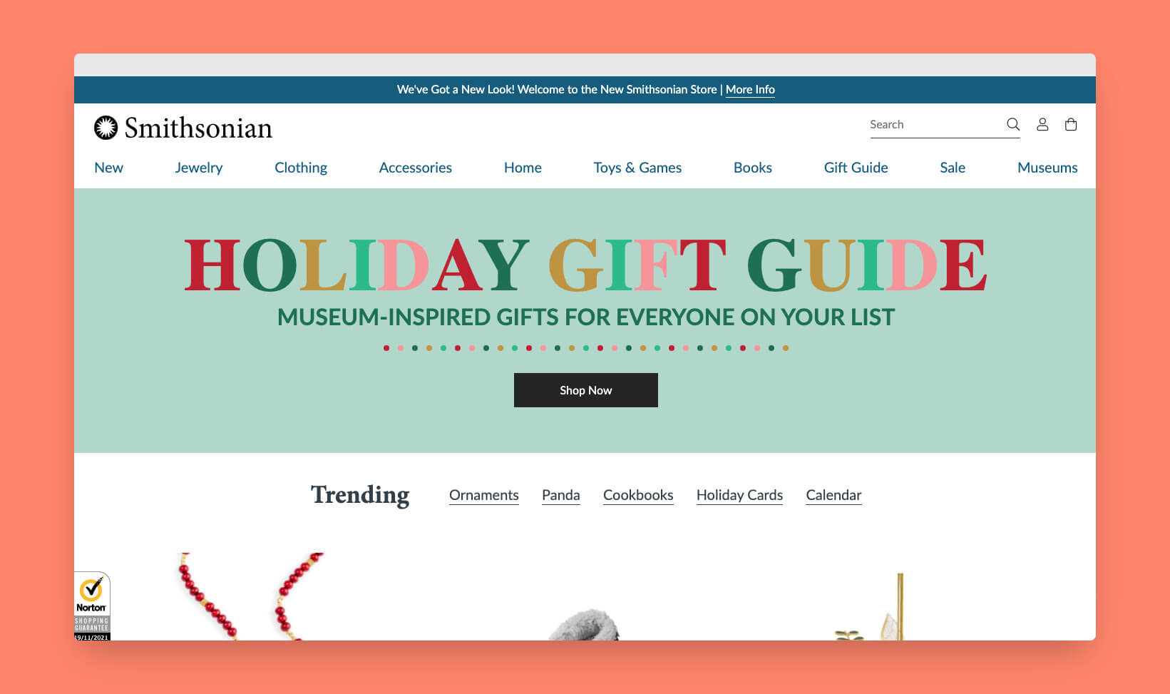
I understand the Smithsonian Institution to be a US national treasure. While I haven’t had the chance to go to one of their museums yet, I have watched Transformers 2 more times than I’d care to admit 😅 IYKYK.
Anyway, getting back on track, they recently relaunched their online store on BigCommerce 🎉. The new design offers a clean, simplified and streamlined ecommerce experience.
From my research I can see they’re using:
• PayPal & Authorize.net for payments
• ForeSee (acquired by Verint) for customer surveys
• BuySafe provide shopping guarantees to give customers confidence
• OptinMonster for conversion optimisation site tools
• Google Optimize for A/B testing
• CJ for affiliate management & tracking
• Acoustic as a marketing platform
• The Trade Desk, Meta, Google and Moat for advertising.
I haven’t found a case study yet but from what I can see, it looks like we have MoJo Active to thank for bringing us this very fine ecommerce site. I can also see they’ve done some interesting work to extend BigCommerce’s PageBuilder to further enhance the content management capabilities, particularly around including promoted products within the mega menu. 👏
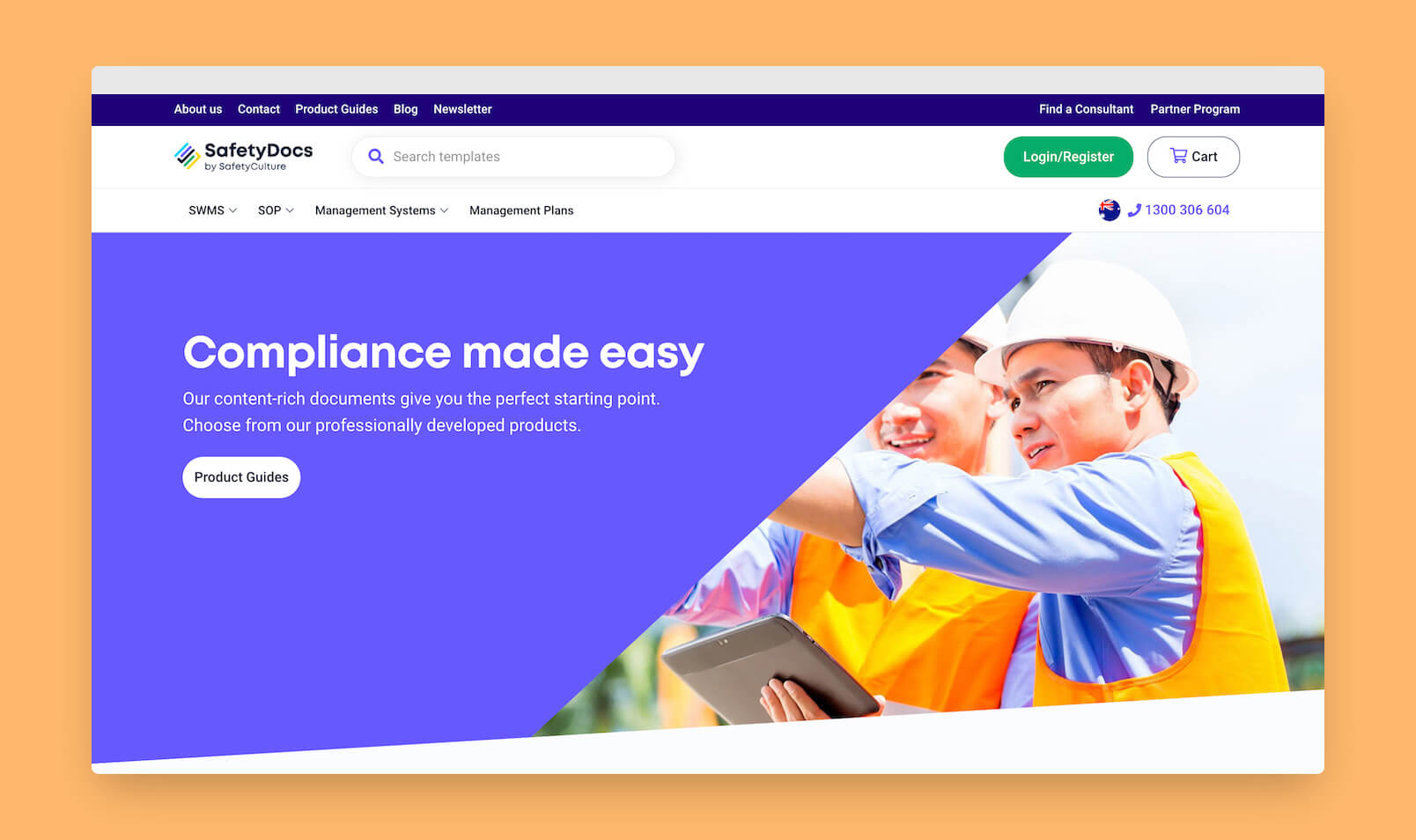
👷♀️🦺 SafetyCulture is on a mission to help companies create safer workplaces. Founded in 2004 in Australia, it is has grown to be a $1bn business.
One of their products, SafetyDocs by SafetyCulture, provides access to high-quality brandable compliance documentation. The site, powered by BigCommerce, recently got a refresh from the team at Convert Digital. B2B might not have a great reputation when it comes to design but they’ve done a nice job here – I’m getting hints of Stripe, which coincidentally power payments on the site.
It’s one of the first BigCommerce stores I’ve come across that predominantly offers digital products that are delivered via email.
The case study (link in comments) boasts a tidy 33% increase in revenue & a 31% increase in conversion rate. 📈
Here are some of the tech partners at play on this one:
• PayPal
• Stripe with support for Apple & Google Pay
• HubSpot CRM
• Quote Ninja BC app
• Elfsight Google Maps app
• Vimeo
• Matomo analytics
• Meta & Google ads
I’ll end with a testimonial for the Convert Digital team provided by Nick Emery.
“Convert surpassed our expectations, always going that extra mile to accommodate our wishes.” 🙌
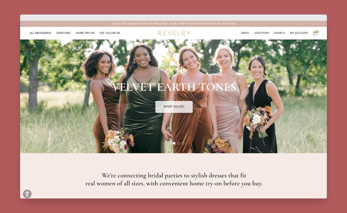
Bridesmaid dress retailer Revelry won the Make It Big 2021 award for Design from BigCommerce:
𝙍𝙚𝙫𝙚𝙡𝙧𝙮 𝙝𝙖𝙨 𝙙𝙤𝙣𝙚 𝙖𝙣 𝙚𝙭𝙘𝙚𝙡𝙡𝙚𝙣𝙩 𝙟𝙤𝙗 𝙤𝙛 𝙘𝙧𝙚𝙖𝙩𝙞𝙣𝙜 𝙖 𝙬𝙚𝙗𝙨𝙞𝙩𝙚 𝙩𝙝𝙖𝙩 𝙡𝙤𝙤𝙠𝙨 𝙜𝙧𝙚𝙖𝙩, 𝙞𝙨 𝙨𝙪𝙥𝙚𝙧 𝙛𝙪𝙣𝙘𝙩𝙞𝙤𝙣𝙖𝙡 𝙖𝙣𝙙 𝙪𝙩𝙞𝙡𝙞𝙯𝙚𝙨 𝙜𝙧𝙚𝙖𝙩 𝙪𝙨𝙚𝙧-𝙜𝙚𝙣𝙚𝙧𝙖𝙩𝙚𝙙 𝙘𝙤𝙣𝙩𝙚𝙣𝙩 𝙖𝙡𝙤𝙣𝙜𝙨𝙞𝙙𝙚 𝙙𝙮𝙣𝙖𝙢𝙞𝙘 𝙘𝙤𝙣𝙩𝙚𝙣𝙩 𝙩𝙤 𝙘𝙧𝙚𝙖𝙩𝙚 𝙖 𝙥𝙚𝙧𝙛𝙚𝙘𝙩 𝙨𝙞𝙩𝙚 𝙛𝙤𝙧 𝙨𝙝𝙤𝙥𝙥𝙞𝙣𝙜 𝙛𝙤𝙧 𝙗𝙧𝙞𝙙𝙚𝙨𝙢𝙖𝙞𝙙 𝙙𝙧𝙚𝙨𝙨𝙚𝙨.
Amen.
As you’d expect, there’s a lot to be impressed about when it comes to site design & content but I particularly like product listing pages with featured sub-categories and animated images on select products.
From a customer experience perspective, the home try-on service is key & core to the company’s mission – making sure that “everyone in your crew” “celebrates love in a dress they love”.
Revelry has chosen a number of industry-leading partners for this one. Firstly their agency partner DigitlHaus Agency, and then their technology partners:
• Zmags for some content pages
• Braintree, PayPal, & Klarna for payments
• Klaviyo for email marketing
• accessiBe as an accessibility overlay
• Justuno for conversion optimisation
• Yotpo for photo product reviews and loyalty program.
• Sharethrough, Quantcast, Meta, Pinterest, TikTok for advertising.
• LiveChat
• Kaltura video platform
• Lucky Orange real-user monitoring.
• InStockNotify for back-in-stock alerts.
• Affiliatly for affiliate management
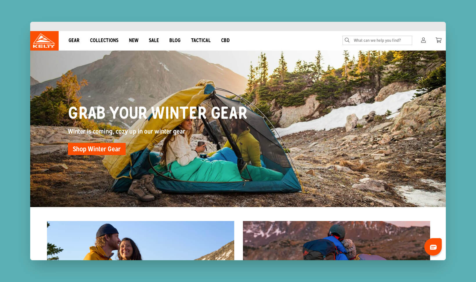
Kelty Pack is a camping gear specialist based in Colorado. Learning about their brand, I appreciate that they build their kit to last, but also they have a lot of fun doing what they do. They don’t take themselves too seriously, they’re about helping people enjoy the great outdoors.
They are part of the Exxel Outdoors group which manages a number of brands. This includes Sierra Designs which won Best Design from BigCommerce a few years back. Impressively they have now moved 10 of their brands over to the platform.
It’s not hard to see why when you read up on their case study. Not only was BigCommerce chosen because it was the low-maintenance SaaS but it also bagged them a mobile revenue increase of 193%.
From a solutions perspective, Exxel Outdoors and their agency partner Weizen Young, have integrated with:
• Klarna, PayPal and First Data Corporation for payments
• FedEx for shipping
• Stamped for reviews
• Shogun for content
• Searchspring for search
• Klaviyo for email marketing
• Crazy Egg for heat mapping and session recording, along with Inspectlet and Microsoft Clarity.
• Freshdesk Customer Success for live chat
• Candid™ for social integration
• Storemapper for dealer locator
• AvantLink for affiliates management.
• Then all the usual suspects for advertising including The Trade Desk.
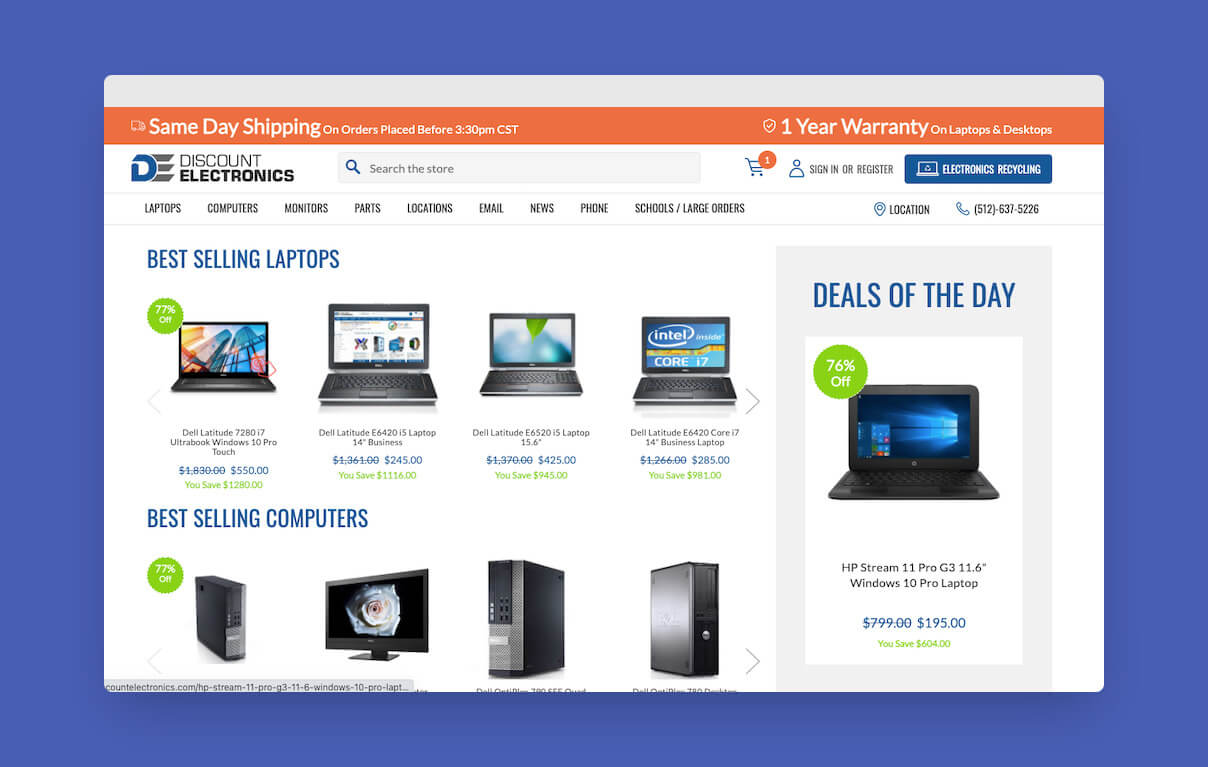
Discount Electronics is a computer hardware retailer that has been partnered with BigCommerce for its online store for many years. Last year, they launched a revitalised & revolutionised storefront
This is a special site, not only because is it a headless BigCommerce implementation, but because it uses Shogun Frontend. This is a technology that I’ve had my eye on for a while and continue to be impressed by what Finbarr & the team are delivering.
If you haven’t come across Shogun Frontend before, you can think of it as an opinionated all-in-one headless solution. Ultimately, you benefit from many of the complexities of going headless being productised away by the experts leaving your development team to get back to site design & commerce experience.
The site re-launched last year and saw immediate results:
• Conversion rate 40% up
• Revenue per user 36% up
We also have a few other familiar faces in use:
• Klaviyo
• Braintree, PayPal & Amazon Payment Services
• Searchspring
• ShipperHQ
• Formspree
• Lucky Orange
• GetEmails
• A number of advertising partners inc. Outbrain, Cybba Taboola, AdRoll, a division of NextRoll and The Trade Desk.
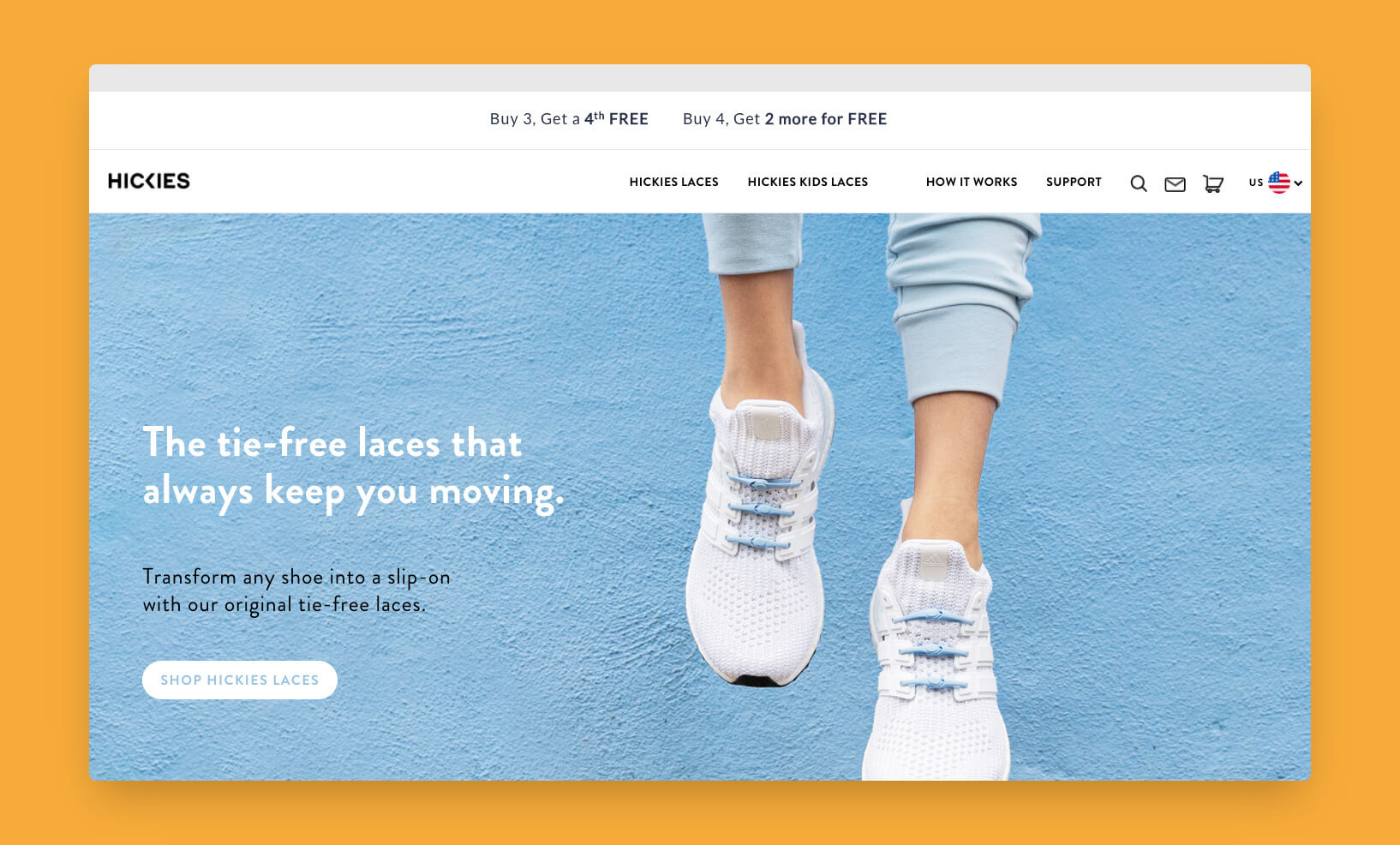
Until today I’ve been tying my laces every day like an absolute caveman. Little did I know that HICKIES had revolutionised shoes with their tie-free laces. 👟
In their re-platform case study, we find that they moved to BigCommerce to better prepare themselves for internationalisation (with a UK storefront no less 🇬🇧).
The freedom to choose payment providers that suited each market was also a key factor in their choice of platform.
Hickie’s use a few, carefully chosen partners:
• Klaviyo
• Google Pay, Apple Pay, Visa Checkout, Braintree & PayPal
• PayHelm analytics
• Vimeo
• Google, Meta advertising
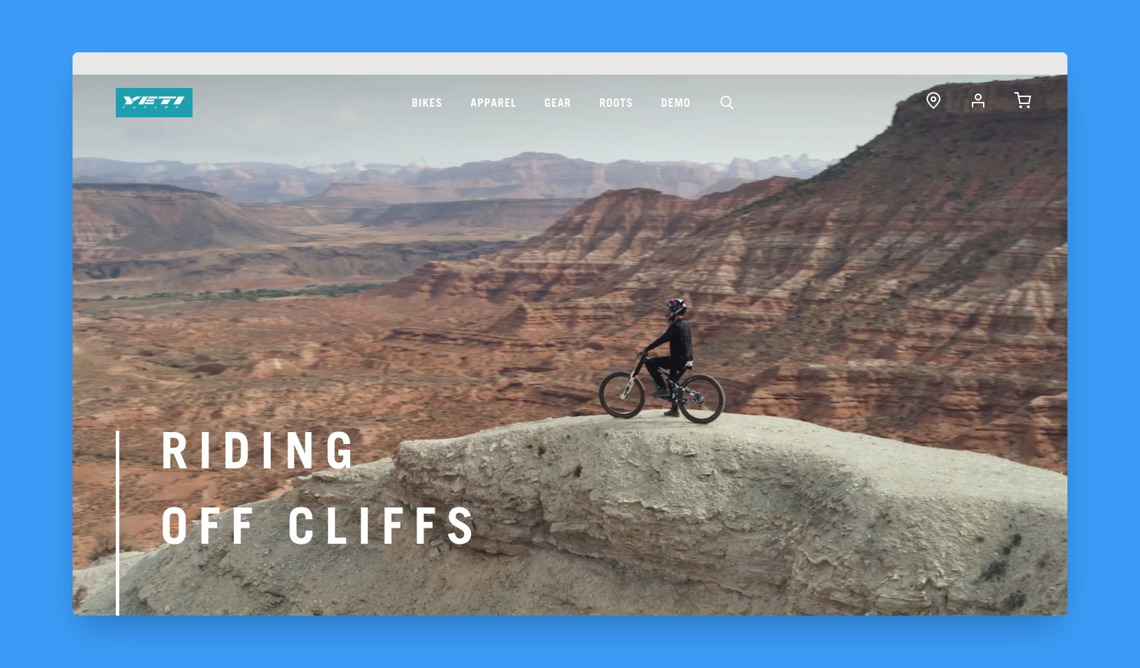
For all the talk about knitting content and commerce, there are very few sites that can pull off being something more than just a transactional experience with some hero images.
Yeti Cycles are one of my go-to examples of an online store that immediately engages & transports you to the life of mountain biking. I can’t help but briefly entertain the idea of taking up a new hobby. I can feel the adrenaline, the freedom and the joy of the outdoors.
The website isn’t to be sniffed at from a technology perspective either. Winning the BigCommerce award for Headless in 2020, it brings together BigCommerce & Prismic in a Nuxt headless implementation to a fantastic effect.
The bold design achieved through a design system that provided reusable components not only gives a consistent experience but also most importantly one that is manageable in day-to-day operation.
Other partners that contribute to the experience are:
• Yotpo
• ShipperHQ
• RoboTurk address validation
• FedEx
• Authorize.net
• Salesforce Marketing Cloud
• eBridge Connections, A Jitterbit Company
• Jasper Commerce, Inc.
• SYSPRO
• Meta
Congratulations to ZaneRay and the Yeti Cycles team for pulling this one off. I would love to have been a fly on the wall for this project. I bet it was a buzz getting it off the ground.