Why Prototype Design Is Essential to Your Website Design Process
We’re part of Dark Matter Commerce - find out more

“I don’t like that grey” – When people think of web prototypes, they normally think of grey boxes and blocks of lorem ipsum (that latin text) all over the page which often leads to a comment about the choice of grey.
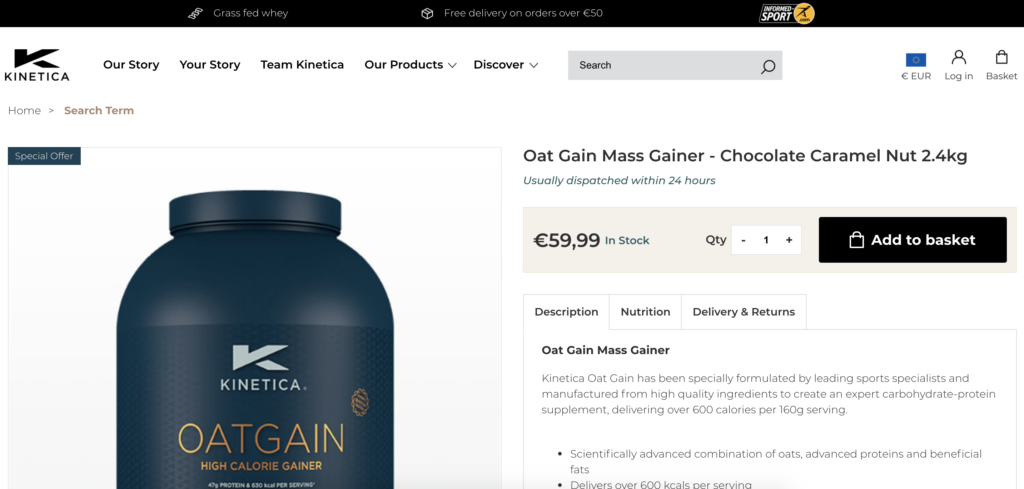
At Space48, when we prototype, we like to go up a level and produce high fidelity prototypes that resemble a working site built around the product you are selling. The aim is to get you familiarised with the site early on as we feel it creates conversations and answers questions often not thought about until much later on and often when the deadline is looming.
At the start of every project, a lot of work goes into the design process to discover what we need to know about you, the client, the product and the problem you are trying to solve. We’ll work together on wireframing ideas and nailing down what each page will need.
By now, we’ll have access to any brand guidelines (don’t stress if you don’t) and a logo along with product images and data. The groundwork is done, it’s time to get designing.
We’re a huge admirer of digital style guides so for every project, we produce a style guide based on what brand guidelines you have which then feeds into our prototyping process. A website is essentially made up of a combination of components that can be reused throughout the site so we prefer to design and build components rather than overall pages using the rules set out in the brand guidelines.
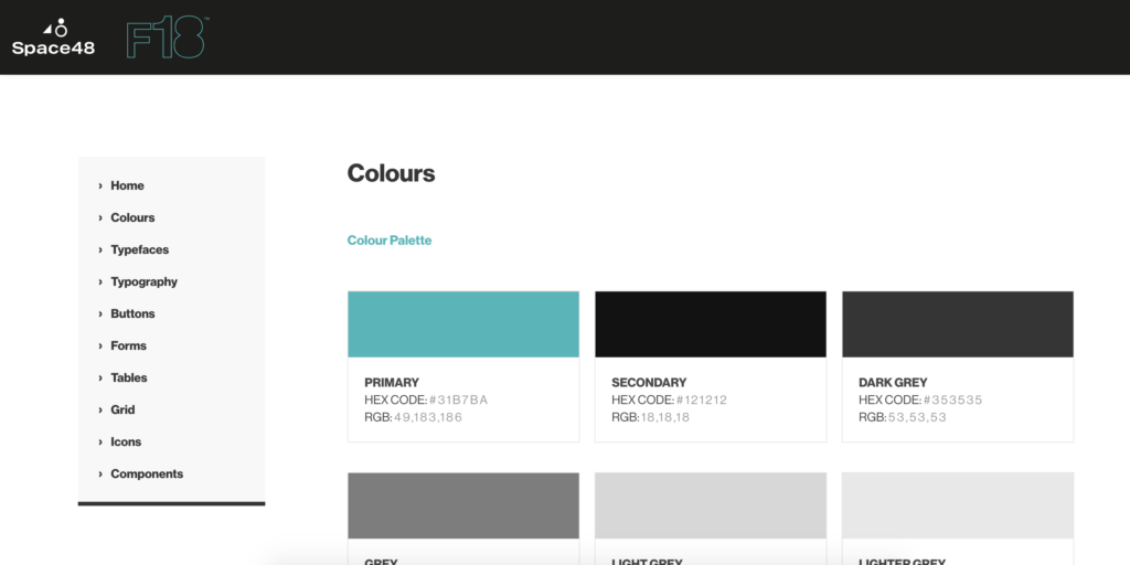
These components when designed are fed into the digital prototype automatically so when changes are made, it is reflected across the style guide and the designs in real-time. Read more about styleguides here.
Our prototypes are built with CSS and HTML, two core components of any website along with javascript. We’re not restricted to just CSS and HTML, there are many software solutions out there like Sketch, Figma or Adobe XD but our core prototyping is done with CSS and HTML. Like we said at the start of the article, we want to get the site in front of you as quickly as possible so we can start to engage and solve puzzles together.
With our style guide feeding into the prototypes, we can now start to focus on producing a static version of the site that is responsive, works on your phone or tablet. You can even click about and do things you would normally do on a functioning eCommerce store like add to bag.
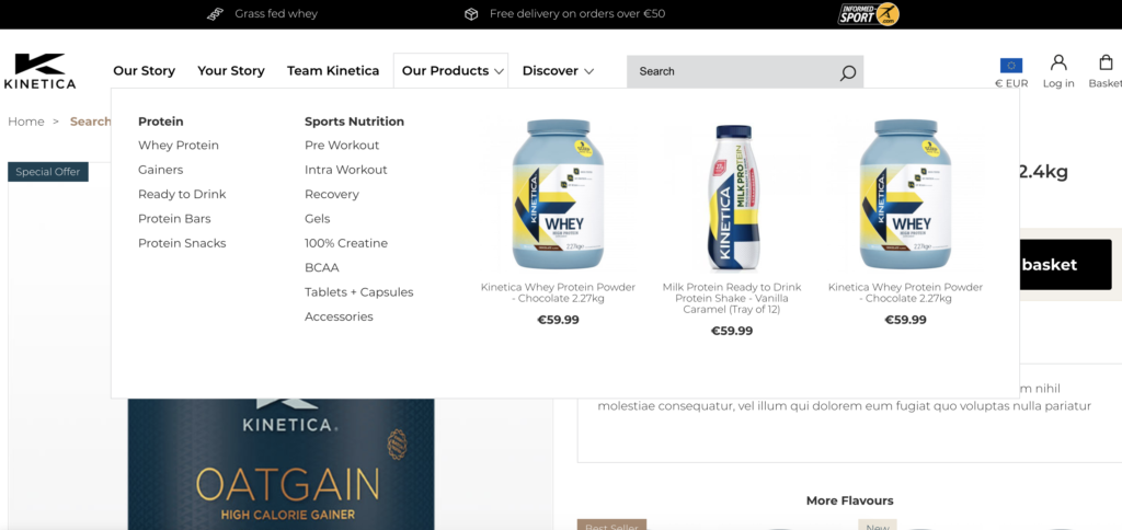
As we are working on actual devices and testing as we go, we start to understand the site inside out and can see the issues you don’t normally see from a flat design.
One example of where it is crucial in the process could be the header might not fit on a smaller laptop screen at 1150px but because we only have one fixed-width image at say 1400px, we never found out until a month or so later when the devs were building it. This then meant the header needed to be redesigned to fit.
When working with prototypes, we find these kinds of issues out within the first few days of designing so we can come up with a solution that fits all and doesn’t stop development work.
It’s standard to have designs for mobile (320px – 370px), tablet if you are lucky (768px) and a desktop screen (1200px- 1400px), this may vary from agency to agency, designer to designer but it’s fair to say you get fixed designs for three or so breakpoints. There is quite a bit that can happen to a site design between 768px and 1400px and it makes sense to capture any issues early on in the design phase than when you are up against it in the dev phase a many few weeks down the line.
Our interaction designers have a solid understanding of HTML and CSS so the vast majority of code they write in the design phase can be reused by the devs on the project. We want to do a lot of the mundane work upfront so that the team can work the bits that really matter like performance or some really cool integration. It also ensures what you sign off as a design is reflected on the live site at the end and hopefully cuts down on the number of amends that can come in. Win-win right?
The beauty of prototyping is that it can be quick and simple or a bit more engineered and detailed as we have explained here. Sometimes projects don’t need a prototype for every page but a project can still benefit from a quick prototype to share an idea or solve a puzzle. They really help and add massive value to a product. If you fancy hearing more about the prototyping to see if it is something you would benefit from or want a demo, please get in touch.