Welcome to Space 48; the home of seamless considered ecommerce & CX. A reimagined Space 48 where we do tomorrow’s thinking, today.
This 5-minute read is a BTS look at how we got to this stage of our journey.
Imagining a new image.
The purpose of our rebrand was to better reflect our values, our services, our approach: our ‘business as usual’ if you will. This started with changing our Space 48 logo.
Changing the logo was not done for the sake of it. After all, a logo is personal. However, the truth is that the previous logo was demanding to use. It was never quite fit for purpose.
Reducing the size of the logo meant that the text was difficult to see. There were no favicons or square versions made. The rectangular shape made it difficult to work with. Next to other logos, it felt obtuse. Awkward and out of place.
Although we are fond of it, we needed something that did the job properly. And we’ve found it.

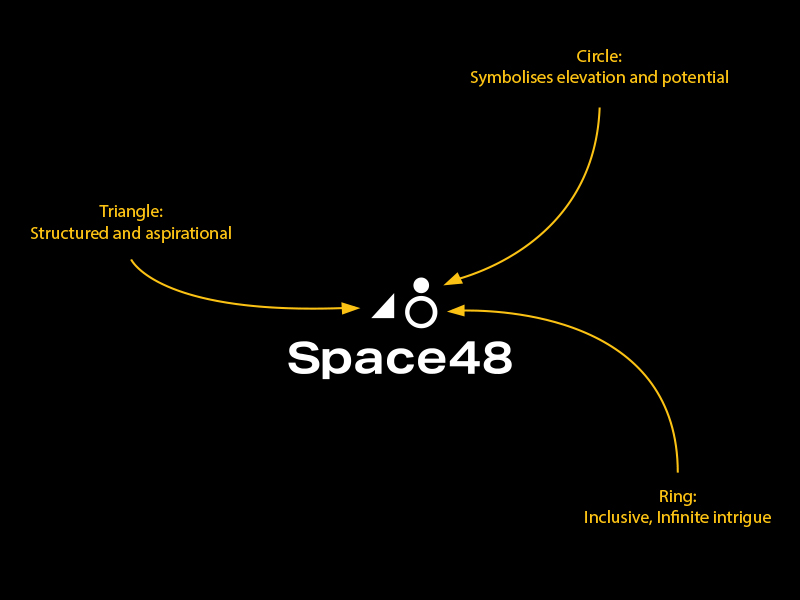
It is now intentionally bold, clean and simple. Our brandmark is a symbol that reflects our brand proposition and values. Simple as it is in appearance, each element of the brand mark conveys a brand truth.
That being said, let’s avoid doing anything of this…

Building the foundations, by design.
Dave Bird joined Space 48 to develop our visual brand. It was time to transform our identity. Creating a brand that reflected our vision was a shared ambition. It was time to take ownership.
Data Driven Delight is the idea behind the brand. A proposition that connects our trusted processes and structure with our expertise and exploration into new and exciting technologies.
The outcome is a bold brand palette that is flexible and versatile. The brand mark is clean and simple but has meaning. It is scalable and memorable. The triangle represents the structured and aspirational; the circle symbolises elevation and potential and the ring is inclusive and communicates infinite intrigue. It has purpose.
*Radio Static* Do you copy?
Before a single word was put to paper, Space48 committed to a Hampson Nattan Williams brand tone of voice workshop.
A fun and forensic study of the perception and projection of values, vision and the language that wraps around the business.
The result? Clarity and consistency that gave context to the interviews, VOC (voice of customer), key messaging and value proposition work that goes into creating words that win business.
Full disclosure: The Space48 tone of voice is Purposeful with a hint of warm friend. We don’t expect you to know what means. But you’ll see this voice in effect all over the site. Warmly filling you in on the purpose of every single page.
So. Tone set, the vision outlined, and purpose-made clear. Once that was in place, giving Space48 a voice was simple. It’s the voice we use to talk to you. The voice you expect to hear. The voice that’s clear across our whole website.

With Workvisible, we work better.
As well as changing our outside, we’ve been hard at work changing our insides too.
Following a period of significant growth and change, Space 48 took a step back to consider how this had affected us, both culturally and from a commercial perspective. Both the business and the team had evolved, and we realised that our original ways of working were no longer fit for purpose. We embarked on an exciting project to create stronger and more efficient operational processes, and a clearer mission, vision and set of values to lead us through the next phase of growth and beyond. Our Culture Team is responsible for developing a values-led culture, and we have a continuing commitment to opportunity, inclusivity and transparency.
Come on an adventure with us.
You’ve discovered our past. Now let’s look to the future. No matter your size, requirements, ambition or scope, we’re always open to discover how we can work together.
There is no ‘one size fits all’. It’s a trial and error (more trial less error). It’s about identifying what is best for you. What represents you the best. You know about our journey. Let us be part of yours.

